Wednesday, 5 November 2014

Final Design

Here is the real magazine cover that I chose to copy. Vogue June 2013. 

It features Kate Moss as the cover model and has used a pink and white colour scheme. The typefaces that have been used are modern and sans serif. 


Here is the magazine cover that I created. I like how the model matches the pose closely to Kate Moss' and that the typefaces are a close match to the original. 

If I were to replicate the magazine cover again, I'd try to get more similar background colours in the image to the original. 


Here is the real double page spread that I chose to copy. Q magazine - Lana Del Rey issue. 

The double page spread features an article on what Lana is like during a photo shoot. The image is dark and shadowy and the text has a serif typeface. 


Here is my copy of the double page spread. I like the accuracy of the typeface on the right hand page. I also like the bokeh effect on the image.

If I was to recreate this again, I would try to get the model to pose in a more accurate position.

Tuesday, 4 November 2014

Making the Double Page Spread

Here is the raw image that I have taken for the double page spread. I tried to make this image look similar to the real magazine image. I did this by doing her make up, hair, nails and choosing similar clothing and jewellery to make my model look similar to the original. 

I used a dark room in my house for the location and used a blue glass candle holder for the out of focus blue object. For the lighting, I used a soft box that I put on the floor to get the right angle of light on the model's face. Finally, I positioned the model to the same pose that Lana Del Rey does on the original image. 


In Photoshop, I darkened sections of the image by using the burn tool. This got rid of the harsh highlights and created more shadow on her face. I used the dodge tool to create highlights where needed. This helped making the image look more similar to the original image.  


To create the bokeh, I used the brush tool to create a circular shape. I then added a filter called Gausian Blur. I did this by going to 'Filter' at the top of the screen, 'Blur' and then 'Gausian Blur'. This gave a slight blured effect to the shape.


I then changed the opacity to 50% and changed the blending mode to various settings that suited the look. For example, 'Lighter Color'.
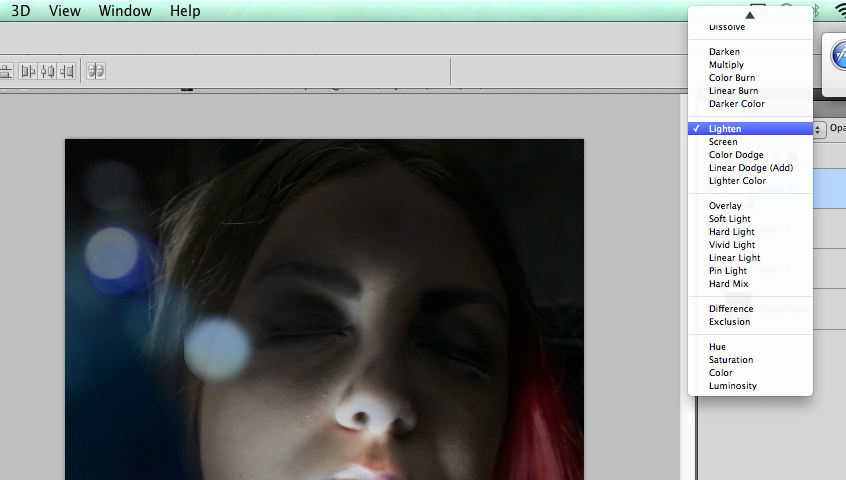

As you can see from the next screen shot, the bokeh is varied slightly in size, colour, blending mode and opacity. This is to give it a more natural effect, like it was there on the raw image.


To create the red streak on her hair, I used the paint brush tool and changed the opacity so that it didn't end up too strong. I used the burn tool and the dodge tool to darken sections of the red to make it look more natural.


After I finished editing the image, I moved onto the second page of the double page spread. First, I made the giant 'S'. I did this by typing in 'S' and changing the size, font, italic and width to make it look like the original. 


To create the arrows at the bottom of the page, I created a rectangle, filled it in with the same shade of red a s the 'Q' box and made a text box saying '>>>'. I changed the font so that the arrows look similar to the original and changed the colour to white. I did a similar process with the page number. 


For the footer's of the pages, I created white rectangles. I changed the height and width of the shape to match it to the original. Then I swapped the layers so that the footer would sit on top of the image. 


I wrote out the text and changed the font colour to grey. I changed the typeface and the size to match the original. 


Monday, 3 November 2014

Making the Cover Page

When making the cover page for the magazine, I used various techniques to edit the raw photo. 

Here is the raw photo that I took. To make my model look similar to how Kate Moss looked on the real cover; I styled her hair, painted her nails, picked out a similar top and did her make up. I found a position in my garden that looked similar to the location on the real cover and I placed purple flowers in the background, on the right hand side. 


The burn tool allows me to darken sections of the image. I darkened the background around the model to match the real Vogue cover that I was replicating. 

The dodge tool allows me to lighten sections of the image. I used this to lighten and highlight the model's skin to create the illusion that there is harsher lighting. 


To darken the background even more, I used the lasso tool. I selected the background and used the fill tool to fill the selection with black. I then changed the opacity of the layer to 45% so that it gives the background a shadowy, dim effect. 


After I edited the image, I positioned it so that the model's head was just touching the top of the page. I then went into InDesign to enter and position the text. 

I started with the masthead. I changed the colour to a pink that matched the original, resized the text and changed the font so that it was similar to the 'Vogue' font that they had used.                                                                                                


I entered the cover lines and tried to alter their properties so that they matched the original text as closely as possible. 


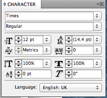
To change various pieces of the text, I altered the leading, tracking, italics, horizontal scale and vertical scale. 

Sunday, 2 November 2014

Magazine Research

I researched magazine covers and double page spreads. I did this by using the internet and looking at magazines that I had already purchased. 

Here are some magazines that I own. I looked through these to see if I could find a certain style or design that I liked. I decided that I preferred the 'Elle' style pages because they seem more stylish than pages from magazines like 'Shout'. This is because they have different target audiences and therefore appeal to different people. The magazines like 'Shout' have a childish look and are more busy than stylish magazines that usually include a lot more whitespace. 


On the internet, I used Pintrest to find ideas. Here I searched 'magazine covers' and 'magazine double page spread'. This came up with many examples. I created a board called 'Magazine Design' and I pinned the results that I liked to that board. I ended up with 112 Pins.


I looked through the board and chose two deigns that I thought were appealing and slightly challenging to recreate. This took a lot of thought as there were many different styles and techniques that had been used across all of the different magazine designs.

For my front cover I chose Vogue June 2013. I chose this because I liked the warm image with the dark background, the range of modern fonts and the pink and white colour scheme for the text.


For my double page spread I chose Q's February 2012 Lana Del Rey article. I chose this because I liked the complexity of the image on the left page. It has strong shadows, an out of focus foreground and a coloured spotlight. The page on the right is all text. It has a huge letter 'S' and some of the text is layered. I would also have to find a very close match for the font so that it looks genuine. 


Thursday, 16 October 2014

Final Design

Here is my final product called 'Randomeyes'. There are eight pages and a foldout poster on the reverse side.

I like how the title is broken up onto two lines. This makes the reader think for a second to work out what it says.

I like the angle that the eyes are at but if I were to do this again, I would pick a more eye-catching pair of eyes.


I love the second page. There is a lot whitespace but this allows the pair of eyes to be the focus point of the page. The eyes are larger than the other eyes on the opposite page and this creates juxtaposition. The diagonal positioning of the eyes makes the page a lot more interesting than if they were horizontal.

The third page has a collection of single eyes that had been drawn in different styles. The fact that they're all different and in varied sizes makes the page more interesting.


The fourth page is my least favourite. I don't like it as much because there isn't much contrast in size and positioning. It doesn't look as exciting as the other pages.

The fifth page has two large eyes that are quite bold. The second eye has textured colour that breaks up the harsh black lines. I like the small detail, on these two eyes, where a thin fine liner has been used. It gives contrast against the thick lines.


The sixth page mirrors the previous page. This creates two sets of eyes. I think that this is a good feature to have in the booklet because it strays from the norm of having each page separate or having a double page directly next to each other when open.

The next page of the booklet features a pair of Disney Princess eyes. These eyes belong to Rapunzel and because they are well known, they draw more attention. Therefore, I have placed them on their own page. This makes them quite striking, especially being vertical and having a large amount of whitespace surrounding them. The colour in this set of eyes is messy and goes over the lines. This is on purpose because it gives character to the drawing.


The four sets of eyes on the last page all belong to Lady Gaga. Lady Gaga has many dynamic styles. These eyes show the diversity of how someone can look, purely from the change in make up. Make up is important to consider when drawing eyes because it can potentially change the way the eye looks.

The eyes have been laid out in rows to show that they are the same eyes but with different make up. It's also different to the other pages because there are so many eyes on one page.


The poster features a large black eye, two pairs of light blue eyes and a title.

The title is small so that it doesn't clutter the page. The black eye is sketchy and characterful, perfect for the main focus point of the poster. The two other pairs of eyes are light blue so that they can be seen as a background and not part of the main picture. They also fall off the page to show that they are not as important as the black eye.

Wednesday, 15 October 2014

Work in Progress

After drawing a sufficient amount of eyes, I scanned the pages of the sketchbook into the computer and edited the images in Photoshop.

In Photoshop, I cropped the image of the sketchbook page to a pair of eyes that I thought would look good in the booklet. Once the page was cropped, I edited the image.


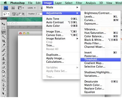
When editing, I changed the threshold so that the grey-scale images became black and white. They become black and white because the threshold changes the contrast of the image.


When the image was purely black and white, I then used the magic wand tool to get rid of the white background to make it transparent. This would make the image more flexible for moving it around other images and text.

After that, I created new layers for the colour. In this case, I was only allowed to choose one colour. This is because in the graphics industry, there may be times where companies can not afford multiple colours for their printer. Here, I chose blue. I used colour on the majority of the images but used light and dark shades to create an interesting variation.

I also tried out textured colour. On one pair of eyes, I thought that having block colour would look not as interesting as a textured look. I went to the drop down menu called 'Filter' and selected 'Pixelate' and then 'Pointillize'.


Tuesday, 14 October 2014

Sketchbook Drawings

 I decided that my booklet's theme would be eyes.

I created a board called 'Eye Drawings' and added pins that I thought I could copy or receive inspiration from.

I looked for different styles and types of eyes on Pinterest. I found sketchy eyes, anime eyes, eyes drawn with pen, eyes drawn with pencil and loads more. Some of the eyes were celebrities eyes such as Lady Gaga and Dan Howell and some of them were little sketches that various people had drawn.

I tried drawing a few animal eyes but they didn't look good drawn on their own, without the rest of the face.

In my sketchbook, I drew the eyes with various types of media including fine liner, pencil and felt-tips. I tried out drawing different eyes with different techniques. For example, one pair of eyes were drawn with fine liner dots and another pair of eyes were drawn with scribbly thick lines. Trying out different techniques gave an interesting variation in eyes that I could have included in my booklet. I drew single eyes and pairs of eyes so that I had more choice in what to include in my booklet.