
When making the cover page for the magazine, I used various techniques to edit the raw photo.
Here is the raw photo that I took. To make my model look similar to how Kate Moss looked on the real cover; I styled her hair, painted her nails, picked out a similar top and did her make up. I found a position in my garden that looked similar to the location on the real cover and I placed purple flowers in the background, on the right hand side.

The burn tool allows me to darken sections of the image. I darkened the background around the model to match the real Vogue cover that I was replicating.
The dodge tool allows me to lighten sections of the image. I used this to lighten and highlight the model's skin to create the illusion that there is harsher lighting.

To darken the background even more, I used the lasso tool. I selected the background and used the fill tool to fill the selection with black. I then changed the opacity of the layer to 45% so that it gives the background a shadowy, dim effect.


After I edited the image, I positioned it so that the model's head was just touching the top of the page. I then went into InDesign to enter and position the text.
I started with the masthead. I changed the colour to a pink that matched the original, resized the text and changed the font so that it was similar to the 'Vogue' font that they had used.

I entered the cover lines and tried to alter their properties so that they matched the original text as closely as possible.

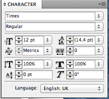
To change various pieces of the text, I altered the leading, tracking, italics, horizontal scale and vertical scale.
No comments:
Post a Comment