Here is the raw image that I have taken for the double page spread. I tried to make this image look similar to the real magazine image. I did this by doing her make up, hair, nails and choosing similar clothing and jewellery to make my model look similar to the original.
I used a dark room in my house for the location and used a blue glass candle holder for the out of focus blue object. For the lighting, I used a soft box that I put on the floor to get the right angle of light on the model's face. Finally, I positioned the model to the same pose that Lana Del Rey does on the original image.
In Photoshop, I darkened sections of the image by using the burn tool. This got rid of the harsh highlights and created more shadow on her face. I used the dodge tool to create highlights where needed. This helped making the image look more similar to the original image.
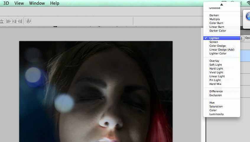
To create the bokeh, I used the brush tool to create a circular shape. I then added a filter called Gausian Blur. I did this by going to 'Filter' at the top of the screen, 'Blur' and then 'Gausian Blur'. This gave a slight blured effect to the shape.
I then changed the opacity to 50% and changed the blending mode to various settings that suited the look. For example, 'Lighter Color'.
 As you can see from the next screen shot, the bokeh is varied slightly in size, colour, blending mode and opacity. This is to give it a more natural effect, like it was there on the raw image.
After I finished editing the image, I moved onto the second page of the double page spread. First, I made the giant 'S'. I did this by typing in 'S' and changing the size, font, italic and width to make it look like the original.
To create the arrows at the bottom of the page, I created a rectangle, filled it in with the same shade of red a s the 'Q' box and made a text box saying '>>>'. I changed the font so that the arrows look similar to the original and changed the colour to white. I did a similar process with the page number.
For the footer's of the pages, I created white rectangles. I changed the height and width of the shape to match it to the original. Then I swapped the layers so that the footer would sit on top of the image.
I wrote out the text and changed the font colour to grey. I changed the typeface and the size to match the original.


No comments:
Post a Comment