In Photoshop, I cropped the image of the sketchbook page to a pair of eyes that I thought would look good in the booklet. Once the page was cropped, I edited the image.
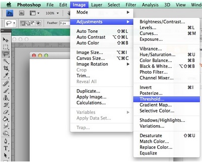
When editing, I changed the threshold so that the grey-scale images became black and white. They become black and white because the threshold changes the contrast of the image.

When the image was purely black and white, I then used the magic wand tool to get rid of the white background to make it transparent. This would make the image more flexible for moving it around other images and text.
After that, I created new layers for the colour. In this case, I was only allowed to choose one colour. This is because in the graphics industry, there may be times where companies can not afford multiple colours for their printer. Here, I chose blue. I used colour on the majority of the images but used light and dark shades to create an interesting variation.
I also tried out textured colour. On one pair of eyes, I thought that having block colour would look not as interesting as a textured look. I went to the drop down menu called 'Filter' and selected 'Pixelate' and then 'Pointillize'.


No comments:
Post a Comment