Thursday 20 November 2014

C.R.A.P. Analysis

Teen Vogue is a fashion magazine who's target audience is aimed at teenagers.


CONTRAST

1 - The two words in the masthead are contrasting. The word 'teen' is in red, italics, lower case and in a sans serif typeface. However, the word 'vogue' is in black, is in upper case and is in a modern typeface.

2 - The small size of the dateline is contrasting with the big size of the masthead.

3 - The colour of the blue plus sign contrasts with the light blonde hair.

4 - 'Makeover' contrasts with the surrounding text. This is because it has been positioned at a slight angle to break up the aligned look.

5 - The bright blue top contrasts against the light cream background colour.

6 - The short necklace contrasts against the long necklace. The necklace's colours of black and white also contrast with each other.

7 - The blonde hair contrasts against the blue top.

8 - The black text contrasts against the solid white background that surrounds it.

9 - The yellow text contrasts against the blue top.

10 - The big text contrasts against the smaller text on the cover.


REPETITION

1 - The colour of red is repeated on text within the cover.

2 - The colour of black is repeated on text within the cover. 

3 - The same font has been used on multiple sections of the text. 

4 - A blue top has been used on the top to match the colour of her eyes.

5 - The same font has been used again.

6 - The size of the text is the same.

7 - Upper case lettering has been used on most of the cover lines.

8 - They have used yellow text to match the blonde hair.

9 - Multiple black necklaces have been used. 

10 - The white background of the text is very similar to the background of the cover model. 


ALIGNMENT

1 - The start of the masthead, the cover lines and the model's arm are aligned

2 - The hair and the end of the cover line are aligned

3 - The centre of 'Teen Vogue' and the centre of the model are aligned

4 - The hair and the plus sign are aligned

5 - 'Teen Vogue' is on one line. 

6 - The bottom of both cover lines are aligned

7 - 'Makeover' sits inline with the shoulders and the neck of the top.

8 - The dateline, masthead and all of the cover lines are aligned.

9 - 'The' is aligned with 'it on!' 

10 - The two cover lines at the bottom of the cover align


PROXIMITY

1 - The masthead.

2 - Cover line (quote).

3 - Cover model.

4 - Cover lines.

5 - Cover line.

6 - Main cover line.


Elle is a fashion magazine that is aimed at middle aged women. 


CONTRAST

1 - The left hand is contrasting against the right hand. The left hand is near the right-hand top of the page where as the right hand is near the bottom of the page on the left. 

2 - 'Elle' is in a big where as the dateline and the pice are small.

3 - The cover model has black hair and white clothes.

4 - The texture of the jumper and the vest are contrasting.

5 - One cover line is in bold were as the cover line above it is not in bold.

6 - The white top contrasts against the dark, shadows in the background.

7 - The skirt colour is also contrasting against the background.

8 - The blue text is contrasting against the green background.

9 - The white text has a black shadow. 

10 - The model has dark eye makeup with pale face makeup.


REPETITION

1 - 'Summer shopping' and 'at oasis' have the same font, colour and size.

2 - The colour blue has been repeated on the text.

3 - The top and the skirt have been made with the same material and in the same colour.

4 - Black has been repeatedly used on the pieces of text.

5 - The white of the text has been repeated to match the white on the top.

6 - White has been used repeatedly on the cover lines.


ALIGNMENT

1 - The top of the masthead and the model's head aligns.

2 - The '20%' and the model's hairline are aligned.

3 - The masthead sits straight on one line.

4 - The bottom of the cover line and the top of the arm align

5 - The top of 'Style' and the bottom of the cover line align.

6 - The centre of 'Style For Less' aligns with the bottom of the cover line.

7 - The masthead and the cover lines align down the side.

8 - The cover model's eye aligns with the centre of 'For Less'.

9 - The cover model's wrist, the start of the cover lines and the 'L' align.

10 - The masthead and cover lines align down the side.


PROXIMITY

1 - Masthead.

2 - Cover model.

3 - Cover lines.

4 - Cover lines.

5 - Main cover line.

6 - Cover line.


CONCLUSION

The Teen Vogue magazine uses more contrast than Elle. This is because Teen Vogue's target audience is younger. The contrast draws more attention to the cover and therefore it is more appealing to a younger reader. Elle has less contrast but enough for the cover to still be eye-catching.

Elle's cover focuses mostly on repetition. The white, blue and black are heavily repeated throughout the cover. The typefaces are also repeated a lot. The repetition gives the magazine a stylish look and makes every aspect compliment each other. Teen Vogue uses a lot of repetition but focuses mostly on the typefaces. They use the cover lines to draw the audience into reading the magazine. By using the repetitive typeface, it links the text together so that the reader can easily start reading the next cover line. 

Elle's lines of alignment are less regular than Teen Vogue's. Elle has not used a line of alignment for the cover lines on the left third of the page. This is to make the cover more interesting than if everything was all aligned. Teen Vogue, however, has a more consistent grid for the alignment. The lines make it easier to make the magazine symmetrical. The audience find the magazine more appealing if there is symmetry within the design than if everything was placed randomly about the page.

The proximity for both magazines are quite similar. Elle overlaps sections more frequently where as Teen Vogue has kept the proximity simple and separate. Teen Vogue has gone for the simpler look so that it isn't too confusing for the younger audience. Elle has gone slightly more complex to create interest to make up for the little contrast

Over all, Elle has a more sophisticated and stylish design to make it come across as exclusive. Teen Vogue has a simple but bold design, appealing to a younger generation.

Friday 14 November 2014

John's Business Card

This is John Panelreader's original business card. The typefaces are concord, similar sizes and the alignment makes the card hard to read and doesn't make the card look eye-catching.


The card below is the business card that I have designed for John Panelreader. 

I used contrasting typefaces to make the design appealing. The positioning of the text and bubble leave whitespace to make the card look professional and tidy. The text flows downwards down the right side so that it's easy to read the information. 

I used black and white so that John could still print the cards with a black and white printer with out loosing effect. 

No complex images have been used so that attention isn't drawn away from the information. 


Thursday 13 November 2014

Scamp Copies


Here are some scamp copies. I drew these out so that I'd have a better understanding on the use of effective white space. 


Wednesday 5 November 2014

Final Design

Here is the real magazine cover that I chose to copy. Vogue June 2013. 

It features Kate Moss as the cover model and has used a pink and white colour scheme. The typefaces that have been used are modern and sans serif. 


Here is the magazine cover that I created. I like how the model matches the pose closely to Kate Moss' and that the typefaces are a close match to the original. 

If I were to replicate the magazine cover again, I'd try to get more similar background colours in the image to the original. 


Here is the real double page spread that I chose to copy. Q magazine - Lana Del Rey issue. 

The double page spread features an article on what Lana is like during a photo shoot. The image is dark and shadowy and the text has a serif typeface. 


Here is my copy of the double page spread. I like the accuracy of the typeface on the right hand page. I also like the bokeh effect on the image.

If I was to recreate this again, I would try to get the model to pose in a more accurate position.

Tuesday 4 November 2014

Making the Double Page Spread

Here is the raw image that I have taken for the double page spread. I tried to make this image look similar to the real magazine image. I did this by doing her make up, hair, nails and choosing similar clothing and jewellery to make my model look similar to the original. 

I used a dark room in my house for the location and used a blue glass candle holder for the out of focus blue object. For the lighting, I used a soft box that I put on the floor to get the right angle of light on the model's face. Finally, I positioned the model to the same pose that Lana Del Rey does on the original image. 


In Photoshop, I darkened sections of the image by using the burn tool. This got rid of the harsh highlights and created more shadow on her face. I used the dodge tool to create highlights where needed. This helped making the image look more similar to the original image.  


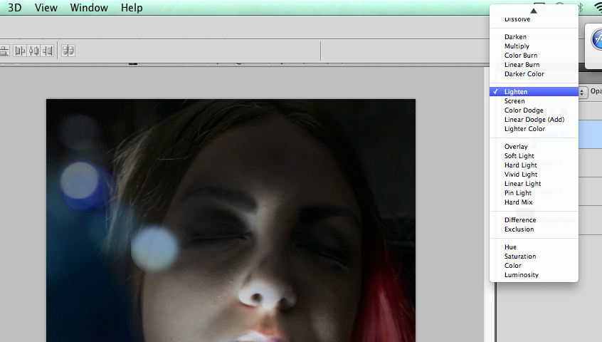
To create the bokeh, I used the brush tool to create a circular shape. I then added a filter called Gausian Blur. I did this by going to 'Filter' at the top of the screen, 'Blur' and then 'Gausian Blur'. This gave a slight blured effect to the shape.


I then changed the opacity to 50% and changed the blending mode to various settings that suited the look. For example, 'Lighter Color'.


As you can see from the next screen shot, the bokeh is varied slightly in size, colour, blending mode and opacity. This is to give it a more natural effect, like it was there on the raw image.


To create the red streak on her hair, I used the paint brush tool and changed the opacity so that it didn't end up too strong. I used the burn tool and the dodge tool to darken sections of the red to make it look more natural.


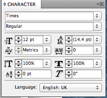
After I finished editing the image, I moved onto the second page of the double page spread. First, I made the giant 'S'. I did this by typing in 'S' and changing the size, font, italic and width to make it look like the original. 


To create the arrows at the bottom of the page, I created a rectangle, filled it in with the same shade of red a s the 'Q' box and made a text box saying '>>>'. I changed the font so that the arrows look similar to the original and changed the colour to white. I did a similar process with the page number. 


For the footer's of the pages, I created white rectangles. I changed the height and width of the shape to match it to the original. Then I swapped the layers so that the footer would sit on top of the image. 


I wrote out the text and changed the font colour to grey. I changed the typeface and the size to match the original. 


Monday 3 November 2014

Making the Cover Page

When making the cover page for the magazine, I used various techniques to edit the raw photo. 

Here is the raw photo that I took. To make my model look similar to how Kate Moss looked on the real cover; I styled her hair, painted her nails, picked out a similar top and did her make up. I found a position in my garden that looked similar to the location on the real cover and I placed purple flowers in the background, on the right hand side. 


The burn tool allows me to darken sections of the image. I darkened the background around the model to match the real Vogue cover that I was replicating. 

The dodge tool allows me to lighten sections of the image. I used this to lighten and highlight the model's skin to create the illusion that there is harsher lighting. 


To darken the background even more, I used the lasso tool. I selected the background and used the fill tool to fill the selection with black. I then changed the opacity of the layer to 45% so that it gives the background a shadowy, dim effect. 


After I edited the image, I positioned it so that the model's head was just touching the top of the page. I then went into InDesign to enter and position the text. 

I started with the masthead. I changed the colour to a pink that matched the original, resized the text and changed the font so that it was similar to the 'Vogue' font that they had used.                                                                                                


I entered the cover lines and tried to alter their properties so that they matched the original text as closely as possible. 


To change various pieces of the text, I altered the leading, tracking, italics, horizontal scale and vertical scale. 

Sunday 2 November 2014

Magazine Research

I researched magazine covers and double page spreads. I did this by using the internet and looking at magazines that I had already purchased. 

Here are some magazines that I own. I looked through these to see if I could find a certain style or design that I liked. I decided that I preferred the 'Elle' style pages because they seem more stylish than pages from magazines like 'Shout'. This is because they have different target audiences and therefore appeal to different people. The magazines like 'Shout' have a childish look and are more busy than stylish magazines that usually include a lot more whitespace. 


On the internet, I used Pintrest to find ideas. Here I searched 'magazine covers' and 'magazine double page spread'. This came up with many examples. I created a board called 'Magazine Design' and I pinned the results that I liked to that board. I ended up with 112 Pins.


I looked through the board and chose two deigns that I thought were appealing and slightly challenging to recreate. This took a lot of thought as there were many different styles and techniques that had been used across all of the different magazine designs.

For my front cover I chose Vogue June 2013. I chose this because I liked the warm image with the dark background, the range of modern fonts and the pink and white colour scheme for the text.


For my double page spread I chose Q's February 2012 Lana Del Rey article. I chose this because I liked the complexity of the image on the left page. It has strong shadows, an out of focus foreground and a coloured spotlight. The page on the right is all text. It has a huge letter 'S' and some of the text is layered. I would also have to find a very close match for the font so that it looks genuine.