
Friday, 20 February 2015

Friday, 6 February 2015
Second DPS Work in Progress
Here is my second double page spread that I have created.
I used InDesign to create it and I used Photoshop to enhance the images.


The giant 'S' contrasts against the small body text and the opposite page that is full of images.
I chose to colour the 'S' in purple because it matches with the man's T-shirt in the first photo and the balloons in the last photo. This links the two pages together.

I used InDesign to create it and I used Photoshop to enhance the images.
For the second image, I decided to draw a skyline. This is so that it would break up the page of images and contrast against the strong colour and detail of the other photos.
I took the three photographs on various holidays. I chose these photos because they fit in with the holiday theme of the article. They give a bright and warm feel to the pages, reminding the reader of the typical feel of a holiday.
I chose to colour the 'S' in purple because it matches with the man's T-shirt in the first photo and the balloons in the last photo. This links the two pages together.
Tuesday, 3 February 2015
First DPS Work in Progress
I have created two double page spreads.
The first dps that I have created has two transparent shapes that fall across the picture. This creates contrast and interest within the design. I created the shapes with the Rectangle tool then dragged the corners out to alter the shape.
The image that I used is one that I had taken when I went to New York. I edited it in Photoshop. I changed the levels, brightness, contrast and saturation to enhance the image.


The body text is sans serif to add a trendy and stylish look to the magazine. The sub headings are slightly larger than the body text and are in bold. This is so that they stand out from the body text and break up the page so that it is easier to read.


The first dps that I have created has two transparent shapes that fall across the picture. This creates contrast and interest within the design. I created the shapes with the Rectangle tool then dragged the corners out to alter the shape.
The image that I used is one that I had taken when I went to New York. I edited it in Photoshop. I changed the levels, brightness, contrast and saturation to enhance the image.
The 'Life Freedom Happiness' text is larger than the rest of the text. This is to create contrast against the rest of the double page spread. I decided that 'Freedom Happiness' fonts were too concordant against each other. I changed the typeface of 'Freedom' so that they contrasted.
The body text is sans serif to add a trendy and stylish look to the magazine. The sub headings are slightly larger than the body text and are in bold. This is so that they stand out from the body text and break up the page so that it is easier to read.
I used a grid when making this so that the different factors of the page align and therefore look more pleasing to the eye.
I added two of my own photographs at the bottom of the right hand page. This balanced the page out against the body text that was taking up the rest of the page.
At the bottom of the right hand page, I included a page number and folio. I also used whitespace around the edge of the body text and in the large pink triangle. This gives a classy effect to the magazine and ensures that the dps isn't too cluttered.
I used two pull quotes to break up the body text. I made them larger and bold so that they'd be eye catching.
Wednesday, 21 January 2015
Contact Sheet
Here is a contact sheet of photos that I have taken that are suitable for my dps. I have circled the ones that I like and have written notes on what I think is good about the images. I have crossed out the images that I don't want to use.

Monday, 19 January 2015
DPS Final Draft - Using a Grid
I have chosen this design to make for my double page spread. I have drawn it out on a grid so that it ensures a look of unity and to help the readability.

Friday, 16 January 2015
Double Page Spread Scamps
Here are my own designs of double page spreads. I was aware of using grids, contrasting sizes, contrasting typefaces, whitespace and effective use of images when designing these pages.


Monday, 12 January 2015
Adjustment Layers - Editing Photo
Here is the raw image that I decided to edit.

First, I altered the levels. I did this by clicking the 'Create new fill or adjustment layer' icon. The icon is a half black and half white circle.

A drop down menu appeared and then I clicked on 'Levels...'.

An adjustments window appears that features a histogram. There are three arrows underneath the histogram that can be moved to change the levels of the image. When altering the arrows positions, the levels of the image change.

Here is the image after the levels have been altered. The darker areas of the image have been deepened and the lighter areas have been lightened.

Next, I changed the colour balance. I selected this option from the same drop down menu as before. To change the colour balance of the mid tones, I dragged the arrows across to get a slightly warmer effect on the image.

Here is the image after changing the colour balance.

After that, I changed the vibrance and saturation. This is also selected form the same drop down menu as before. By increasing the vibrance, the image's colour becomes more intense. By increasing the saturation, the orange/yellow colour in the image intensifies.

Here is the image after changing the vibrance and saturation.

Monday, 15 December 2014


Creating the Magazine Cover
I created the covers in InDesign.
I used contrasting typefaces and colours for the masthead and cover lines. The masthead is in script type and the majority of the cover lines are in sans serif. The black and white colours contrast with the red font to add colour to the cover. This draws attention and breaks up the constant black and white. Also, the sizes of the text vary to create contrast.
I used a grid to make sure that the cover lines were aligned. This made it look neat and professional.

I changed the width, height, kerning, tracking and size of the cover lines.


Editing the Images
After I chose the best images, I imported them into Photoshop. Here are the original images that I chose.


In Photoshop I used the Dodge Tool, the Burn Tool and the Lasso Tool the most.
The Dodge Tool allows me to lighten sections of the image and the image's light still looks natural.
The Burn Tool darkens sections of the image. This creates a natural looking shadow.

I used the Lasso Tool to select sections of the image. Then I chose a dark brown colour and filled the section. I changed the opacity to 10% so that the colour wasn't so strong. This created a slight brown tint to the section of the image.

I created separate layers for each technique that I chose to use on the image. This made it easy to tweak or get rid of different effects.

Contact Sheet
I created a contact sheet before creating the magazine. This is so that I can see what pictures I have taken and choose ones that I may use for the cover image. I created the sheet in Bridge then imported them into Photoshop so that I could draw and write on the sheet. 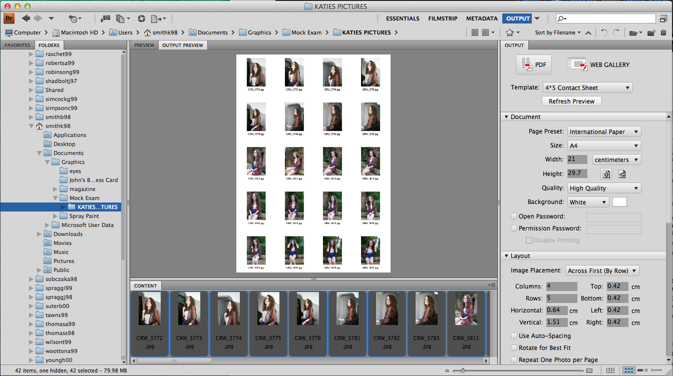
Here is my contact sheet. I have crossed out the photos that I don't want to use. I then wrote notes on what I like about the photos.


Sunday, 14 December 2014
Magazine Cover Scamps
Here are some scamps that I have made for ideas on what my magazine cover will look like. I tried out different cover model poses, typefaces for the masthead and positioning and sizes of the cover lines.


Friday, 5 December 2014
Spray Paint Magazine Cover
Here is my final spray paint magazine cover.
I like the complimentary colours and the contrasting size difference of the different pieces of text.
If I were to improve anything, I'd play around with the fonts of the cover lines.

Thursday, 4 December 2014
Creating the Magazine Cover
After I had imported the three images into Photoshop, I positioned them so that they made up the original shape of the image. I then chose a brush that replicated the look of spray paint. I used the brush to create smudges on the images and a yellow sticker to sit behind the main cover line. I made the sticker semi-transparent so that you could still see hints of the cover image underneath, I did the same with the masthead.

Next, I found a barcode from the internet and imported it into Photoshop. I positioned it in the bottom left hand side so that it was visible but not in the way of the text or image.

After that, I created the cover lines. I varied the colour of the text but kept it within the colour scheme. Varying the colour meant that it draws attention and makes it more readable for the audience. The font of the cover lines were in Calibri. This is because it's readable and sans serif. Sans serif font works well with my magazine cover because it isn't formal.


Cut Out, Stencil Spray
I created a stencil and sprayed it with spray paint to create a black stencil spray image.
First I found an image. I chose an image of Dan Howell (Radio 1 Personality and professional YouTuber - danisnotonfire). I chose this image because it is clear, he looks straight into the camera and it's simple.


I was left with three different sections of the image. When put together, they would create the whole image shown by the three tones.

I put the image into Photoshop. Here, I altered the threshold, changed the levels to 3 and added an artistic filter. I then selected every tone, apart from white, and made a new layer to fill the shape with black. This meant that I'd have three separate layers with different tones on each one. This would make it easier to cut out later on.
After printing out the separate layers, I used a craft knife to cut out the black areas so that I'd be left with a stencil.
Using the stencils, I spray painted three A4 pieces of paper.
I was left with three different sections of the image. When put together, they would create the whole image shown by the three tones.
Subscribe to:
Posts (Atom)