Here are my final magazine covers.
Monday, 15 December 2014
Creating the Magazine Cover
I created the covers in InDesign.
I used contrasting typefaces and colours for the masthead and cover lines. The masthead is in script type and the majority of the cover lines are in sans serif. The black and white colours contrast with the red font to add colour to the cover. This draws attention and breaks up the constant black and white. Also, the sizes of the text vary to create contrast.
I used a grid to make sure that the cover lines were aligned. This made it look neat and professional.
I changed the width, height, kerning, tracking and size of the cover lines.
Editing the Images
After I chose the best images, I imported them into Photoshop. Here are the original images that I chose.
In Photoshop I used the Dodge Tool, the Burn Tool and the Lasso Tool the most.
The Dodge Tool allows me to lighten sections of the image and the image's light still looks natural.
The Burn Tool darkens sections of the image. This creates a natural looking shadow.
I used the Lasso Tool to select sections of the image. Then I chose a dark brown colour and filled the section. I changed the opacity to 10% so that the colour wasn't so strong. This created a slight brown tint to the section of the image.
I created separate layers for each technique that I chose to use on the image. This made it easy to tweak or get rid of different effects.
Contact Sheet
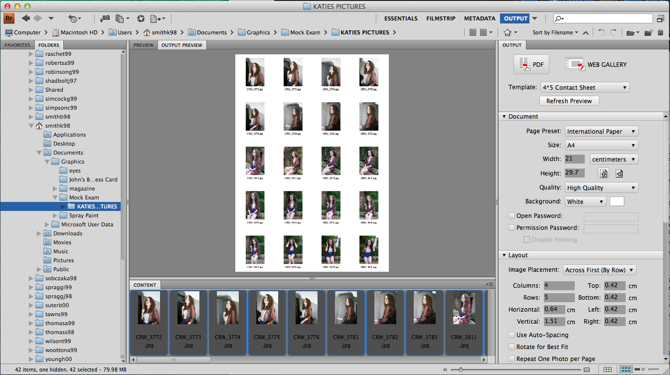
I created a contact sheet before creating the magazine. This is so that I can see what pictures I have taken and choose ones that I may use for the cover image. I created the sheet in Bridge then imported them into Photoshop so that I could draw and write on the sheet. 

Here is my contact sheet. I have crossed out the photos that I don't want to use. I then wrote notes on what I like about the photos.
Sunday, 14 December 2014
Magazine Cover Scamps
Here are some scamps that I have made for ideas on what my magazine cover will look like. I tried out different cover model poses, typefaces for the masthead and positioning and sizes of the cover lines.
Friday, 5 December 2014
Spray Paint Magazine Cover
Here is my final spray paint magazine cover.
I like the complimentary colours and the contrasting size difference of the different pieces of text.
If I were to improve anything, I'd play around with the fonts of the cover lines.
Thursday, 4 December 2014
Creating the Magazine Cover
After I had imported the three images into Photoshop, I positioned them so that they made up the original shape of the image. I then chose a brush that replicated the look of spray paint. I used the brush to create smudges on the images and a yellow sticker to sit behind the main cover line. I made the sticker semi-transparent so that you could still see hints of the cover image underneath, I did the same with the masthead.
Next, I found a barcode from the internet and imported it into Photoshop. I positioned it in the bottom left hand side so that it was visible but not in the way of the text or image.
After that, I created the cover lines. I varied the colour of the text but kept it within the colour scheme. Varying the colour meant that it draws attention and makes it more readable for the audience. The font of the cover lines were in Calibri. This is because it's readable and sans serif. Sans serif font works well with my magazine cover because it isn't formal.
Cut Out, Stencil Spray
I created a stencil and sprayed it with spray paint to create a black stencil spray image.
First I found an image. I chose an image of Dan Howell (Radio 1 Personality and professional YouTuber - danisnotonfire). I chose this image because it is clear, he looks straight into the camera and it's simple.
I was left with three different sections of the image. When put together, they would create the whole image shown by the three tones.
I put the image into Photoshop. Here, I altered the threshold, changed the levels to 3 and added an artistic filter. I then selected every tone, apart from white, and made a new layer to fill the shape with black. This meant that I'd have three separate layers with different tones on each one. This would make it easier to cut out later on.
After printing out the separate layers, I used a craft knife to cut out the black areas so that I'd be left with a stencil.
Using the stencils, I spray painted three A4 pieces of paper.
I was left with three different sections of the image. When put together, they would create the whole image shown by the three tones.
Tuesday, 2 December 2014
Subscribe to:
Comments (Atom)


